




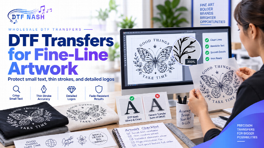
Fine-line artwork creates a different ordering problem from a bold logo or a large block graphic. Small text, narrow strokes, intricate line work, and tightly packed details may look clean on a monitor but become harder to evaluate once the design is reduced to its intended transfer size. For apparel businesses and print buyers, the most important step is not adding more decoration. It is confirming that the artwork still communicates clearly at the physical size that will actually be produced.
That makes fine-line DTF work an artwork-control problem before it becomes a printing problem. Buyers comparing custom DTF transfers by size should review the design at its final dimensions, not only at a large zoom level on screen.
Judge the Design at Finished Size
A detailed logo can be visually impressive when viewed full screen. The same artwork may behave very differently when reduced for a left-chest placement, sleeve mark, youth garment, or small merchandise graphic. Before ordering, set the artwork to the exact finished dimensions you intend to use and inspect the smallest important elements.
Look at letters, counters inside letters, narrow gaps, outlines, tiny icons, and any detail that depends on a very small separation between shapes. The question is simple: if those details soften or close visually, does the design still make sense? If the answer is no, the artwork needs attention before quantity planning begins.
Do Not Use Resolution as the Only Quality Test
File resolution matters, but a high-resolution file does not automatically make every design printable at every size. DTF Nash’s artwork guidance asks for a print-ready file at a minimum of 300 DPI and a transparent background where appropriate. That is a useful technical baseline, but the buyer still needs to evaluate the actual design structure.
A sharp file can still contain text that is too small for the intended use, hairline details that disappear visually, or multiple shapes separated by gaps that become difficult to distinguish. Resolution protects image information; it does not make an unsuitable scale automatically suitable.
Check Small Text as Text, Not as Decoration
When words carry important information, readability should take priority over keeping every original detail. This is especially important for business names, department labels, web addresses, event dates, sponsor names, and other content that must be understood rather than merely seen.
Review small text at normal viewing distance. If you have to zoom in to read it, the final garment may ask too much of the viewer. Consider whether the text can be enlarged, simplified, moved to a separate placement, or removed from the smallest version of the artwork.
Watch Thin Strokes and Narrow Negative Spaces
Fine-line designs often depend on contrast between a stroke and the empty space around it. As a design gets smaller, narrow gaps can visually collapse and thin lines can lose emphasis. That may affect script lettering, detailed emblems, technical line art, illustrated logos, or decorative borders.
Instead of looking only at the outline, examine the relationship between neighboring elements. A thin line that is acceptable on its own may still be difficult to read when surrounded by other fine details. Simplifying selected areas can protect the identity of the artwork better than shrinking everything proportionally.
Remove Effects That Create Unclear Edges
Artwork intended for DTF production should be clean and deliberate. DTF Nash’s file guidance specifically warns against semi-transparent pixels and soft edge gradients in print-ready artwork. For fine-line designs, those effects can make the boundary between the intended graphic and its surrounding space less clear.
If a logo relies on soft transparency, glow, blur, or feathered edges, decide whether those effects are essential to the design. A cleaner version may be more appropriate for a small transfer. The goal is not to make every design flat; it is to make sure the production file reflects the visual result you actually want.
Create Size-Specific Versions When Necessary
One master logo file does not always need to serve every placement. A large back print may support more detail than a small chest mark. A brand can preserve the same identity while using a simplified small-format version with fewer micro-details, stronger spacing, or larger text.
This is especially useful for B2B programs that repeat the same brand across staff shirts, event apparel, uniforms, and merchandise. Document which artwork version belongs to which finished size so future orders do not accidentally use the detailed large-format file in a small placement.
Check the Entire Order Before Building Volume
Fine-line risk becomes more expensive when a design is repeated across a large order before anyone reviews it at final scale. Before committing to volume, confirm the artwork version, finished dimensions, spelling, proportions, transparency, and the smallest critical details.
If the same project includes several formats, the broader DTF transfer options can be reviewed after the artwork decisions are complete. The order format should support the approved design; it should not be used to solve an unresolved artwork problem.
Fine-Line Artwork Checklist
- Inspect the design at its exact finished transfer dimensions.
- Confirm that small text remains readable without zooming.
- Review thin strokes, narrow gaps, and interior spaces.
- Use a clean, print-ready file with appropriate resolution.
- Avoid unintended semi-transparent pixels and soft edge gradients.
- Create a simplified small-size version if critical details become unclear.
- Assign each approved artwork version to the correct placement and size.
- Recheck spelling, dimensions, and proportions before ordering quantity.
Protect the Message Before the Detail
Fine-line artwork does not need to be avoided. It needs to be evaluated with the final physical size in mind. The strongest production file is not always the version with the most detail; it is the version that preserves the information and visual identity the garment actually needs to communicate. By reviewing small text, thin strokes, negative space, transparency, and size-specific artwork before the order is placed, B2B buyers can make detailed DTF work far more predictable.