




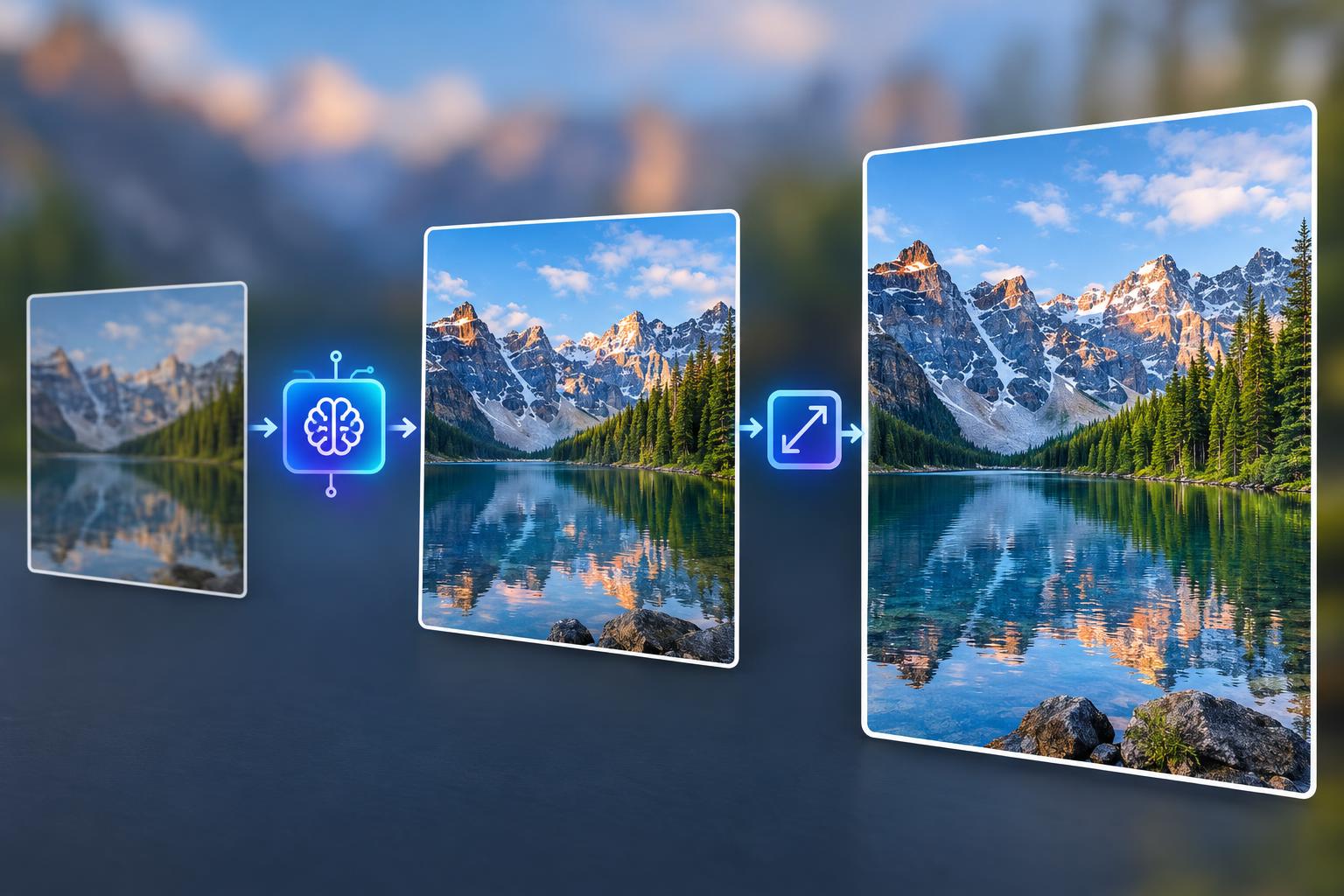
Most conversations about AI images begin in the same place: write a prompt, generate something new. That is useful when the page is empty. It is often the wrong move when you already have a photograph that is nearly right.
The more common problem is quieter. A product shot has the wrong background. A portrait would work if the light were softer. A restaurant photo is sharp, but the sauce looks dull and the table edge is distracting. The picture exists. It simply does not look the way you intended, and the file may be too small for the place where it needs to appear.
Those are two separate problems, and they should be solved in a specific order. First make the picture say the right thing. Then make it large enough to use.
The real problem is usually not a missing image
Content teams often treat every visual problem as a production problem. If a photo is not working, the instinct is to brief a new shoot, generate a new concept, or search a stock library for something closer. Sometimes that is justified. Often it is an expensive way to solve an issue that could be handled with a few precise changes.
Think about the last image you almost used. The subject was probably fine. The composition may have been close. What stopped you was likely a specific detail: a sign in the background, a color that did not match the brand, an object that should not be in frame, or a product that needed to sit in a cleaner environment.
Those are editorial decisions. They are not evidence that the original photograph was worthless. Keeping the real subject also preserves something a generated replacement can lose: the exact shape of a product, the particular expression of a person, or the small imperfections that make a scene believable.
That is why editing an existing image is often the more efficient choice. You are not asking a model to invent a new world. You are asking it to make a controlled change to a world that already exists.
Edit first, upscale second
Resolution cannot rescue weak content. A larger version of the wrong picture is still the wrong picture. If the crop cuts off the product, the background competes with the subject, or the mood does not fit the brand, more pixels will only make those problems easier to see.
There is also a practical cost to doing the work backward. An edit can change the crop, remove an object, replace a surface, or shift the subject. If you upscale first, you may spend time and credits refining details that are about to disappear. If you crop after upscaling, you give back some of the resolution you just paid for.
The safer sequence is simple: solve the content while the file is still easy to iterate on, approve the composition, and only then increase the resolution.
This order matters even for a single image. It matters much more when you are preparing a set of product photos, listing images, or social crops that need to look consistent.
Generate only when the subject itself is wrong
Editing is not always the answer. A new generation makes more sense when there is no usable source image, when the subject is missing, or when the concept needs to be rebuilt from scratch. It can also be the right choice for an illustration, a fictional scene, or a campaign idea that does not depend on photographic evidence.
Use an edit when the subject and layout are already close and one to three details need to change. Use a new generation when changing the details would mean replacing the subject, the setting, and the story at the same time.
That distinction protects you from a common failure mode. Asking a model to “make the whole image better” gives it permission to restage the scene. The subject may drift, a second copy of a prop may appear, or a plate may turn into a pan. A narrow edit is easier to judge because you know exactly what was supposed to change.
Describe the edit like a retoucher
The quality of an AI edit depends heavily on the brief. A vague request such as “make it more professional” sounds reasonable, but it does not tell the model which part of the image is wrong. Professional can mean cleaner, warmer, darker, less cluttered, more expensive, or simply more consistent with the rest of a page.
Name the change first. Then name what must stay the same. A useful brief has three parts:
- Change this specific element.
- Keep the same subject, angle, crop, and surrounding objects.
- Do not alter text, logos, product labels, or the number of items in the scene.
For example: “Replace the gray tabletop with a warm oak surface. Keep the same product, label, camera angle, crop, and background wall. Do not change the shape of the bottle or the position of the glass.”
That is much easier to evaluate than a paragraph of mood words. If the result is close but not right, make the next request smaller. Point at the part that failed. Say that the label is still crooked, the shadow falls in the wrong direction, or the fabric texture looks too smooth.
This is also where a browser-based editor becomes useful. Photiu’s AI Photo Editor lets you upload the photo you already have and describe the change in ordinary language. The value is not that it removes every manual step. The value is that it shortens the distance between the version in your head and a version you can inspect.
Inspect the result before you enlarge it
AI edits can look convincing at a glance and fail under a closer check. Before you move on, compare the output with the source at full size. Do not judge it from a thumbnail.
Check the subject first. Is it still the same object or person? Does it have the right number of parts? Are the proportions believable? A bottle with a slightly different neck, a jacket with an extra button, or a table setting with one missing plate can be enough to make the image unusable.
Then check the edges. Look at hair, straps, handles, shadows, and the boundary between the subject and the new background. Smooth edges are more important than dramatic detail. A sharp subject pasted onto a soft background will always look like a composite.
Next, read every piece of text in the frame. Labels, packaging, signs, menus, and screens are common failure points. If the text is part of the product, it has to remain accurate. A beautiful image with an invented ingredient list is not a finished asset.
Finally, check the light. The direction of the highlights and shadows should match the scene. If the subject was lit from the left, a new background lit from the right will feel wrong even when the colors are attractive.
Keep the source and the edited version side by side until the image passes these checks. The goal is not to prove that AI can make a change. The goal is to make sure the change belongs in the picture.
Resolution is a separate decision
Once the content is right, the next question is whether the file is large enough for its destination. A preview, a product page, a social crop, and a print all have different requirements. A file that looks fine in a browser can fall apart when it is enlarged or cropped.
This is where free upscalers often disappoint. Some stop at a size that is still too modest. Some sharpen aggressively until textures look crunchy. Others show a promising preview and reserve the useful download for a paid plan.
A more practical test is whether the output is large enough for everyday publishing and still looks like a photograph. Photiu’s Image Upscaler is built around that use case. The free version can raise an image to 2600 pixels, which is enough for many websites, social posts, and product listings. Paid credits unlock larger output, up to 8K, for print work, large hero images, or crops that need to stay sharp after they are tightened.
That higher ceiling should be a deliberate choice, not the default. If a 2600-pixel file already looks clean at the size it will be displayed, buying more resolution does not improve the page. It only creates a heavier file.
A workflow you can repeat
The best process is boring in the right way. Start by auditing the source. Decide whether the subject is usable. If it is, write a narrow edit brief and change only what is necessary. Inspect the result at full size, then correct one detail at a time. When the content is approved, upscale to the size the destination actually needs. Export the final file with a name that identifies the version, and keep the original nearby.
That sequence has three advantages. It reduces wasted generations, because you are not asking the model to solve several problems at once. It protects the subject, because each pass has a clear boundary. And it keeps resolution decisions separate from creative decisions, so you can judge the image on content before you judge it on sharpness.
The useful shift is not “use more AI.” It is finishing with a photo that looks the way you intended and is large enough to publish. Change the picture first. Then make it large enough to use. For many images, that is the whole job.